On The Back Cover …
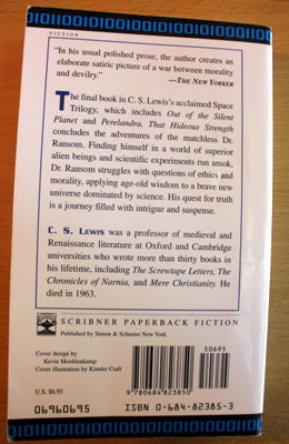
 This is my copy of That Hideous Strength, the third of the “Space Trilogy” by C.S. Lewis. If for some reason the photo here isn’t showing or you can’t make out the words, here is this edition’s back-cover copy:
The final book in C.S. Lewis’s acclaimed Space Trilogy, which includes Out of the Silent Planet and Perelandra, That Hideous Strength concludes the adventures of the matchless Dr. Ransom. Finding himself in a world of superior alien beings and scientific experiments run amok, Dr. Ransom struggles with questions of ethics and morality, applying age-old wisdom to a brave new universe dominated by science. His quest for truth is a journey filled with intrigue and suspense.
That’s a brilliant back cover, it is. Simply smashing, and quite accurate, if you don’t count the following parts:
- The world isn’t filled with “superior alien beings.”
- There is science, and an evil National Institute for Co-ordinated Experiments, but never “scientific experiments run amok.”
- Dr. Ransom hardly struggles with ethics and morality; he knows them.
- Dr. Ransom isn’t even the main character.
So other than that, the back cover is accurate.
Lest it be said that perhaps someone only read the book once, and based the description on dodgy memory — I’ve also read the book only once (excepting going back to review some parts), and remember better.
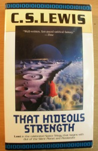 By the way, Hideous’s front cover isn’t much better. While the previous installments of this edition have included very “literal” illustrations, I’ve never been able to figure this one out, and conclude it’s somehow metaphorical. (Who are the men in the middle? Ransom? Mark Studdock? The N.I.C.E. villains? Merlin? And what world is this?)
Yet what’s the deal with this strange back-cover description? Have you read other back covers that didn’t quite match the actual novel? What about those covers that either give away too many details, or don’t reveal enough about the story within? Have you, as an attempting or published novelist, found difficulty writing your own novel’s back-cover-style summary, or has someone else written that for you?








That sounds and looks more like “Out of the Silent Planet” than “That Hideous Strength”.
I think that most large publishers have their marketing teams write the back cover copy for their books, with input from editorial and the authors at times.
Writing back cover copy is tough because you’re trying to boil down the essense of the story while also providing an irresistable hook that will make people want to read the story.
I think that’s usually easier for someone who isn’t as attached to the book as an author is.
I wrote the back cover copy for Starfire, along with my publisher’s editorial input, and I’m not sure that it struck the right balance of engaging and informative. Maybe I should have just said, Alien dinosaurs seek the ultimate weapon! But will it save them or doom them? 😉
Wait…back cover copy is supposed to actually be recognizable from the book?
Sheesh. I never knew.
While there are about 80 or so pages in the middle of That Hideous Strength that I felt weren’t necessary, this book still intrigues, entertains and challenges me. It’s my favourite book in The Cosmic Trilogy.
Yes, I’ve seen several books with either incorrect or incredibly bland summaries on the back. I’ve seen more incorrect book covers though. It seems that the 60’s and 70’s were an especially good time to have an artist incorrectly portray the contents of your book.
I like the cover of your copy, even though I don’t understand it either.
My copy of That Hideous Strength is abridged, a 1973 Pan Books publication. Let’s see it’s summary:
“Over Earth The Shadow of a Dark Wing…
A small English town becomes the centre of a gigantic conspiracy against the human race when a truly devilish organisation wishes to recreate mankind in the image of slave robots.
Ranged against them are Dr. Ransom, the clairvoyant Jane, and Druid Merlin who ascends from his Arthurian tomb to become an ally of planetary angels. Together they face the dark powers of evil…”
It’s not terrible, although the first part makes it sound like bad sci-fi fiction and the second part is intriguing but gives too much away in regards to Merlin. That said, it feels more true to the actual story than your copy.
I don’t like the front cover of mine, ick!
http://www.darkwood.co.uk/images/17274.jpg
Who is that floating head meant to be, Merlin? And why are there castles? And what’s with the marbled garden floor leading to a pool of water? I don’t remember any this.
As I’m still (more like properly beginning) my speculative novel, I haven’t attempted to write my own back cover summary yet but I’ve thought about it. I think the worst ‘sin’ you can do in writing it is to make it boring and this goes especially for the summary, since it’s meant to help sell the book. How do you strike the balance between reeling in the reader and revealing too much? Yes, it’s one of those age-old dilemmas, isn’t it?
I’m loving the new look to the site and the new content. Keep at it!
That’s indeed a stranger cover than my edition, Christian. I wonder if part of the problem (whether past or present) is that many artists don’t quite understand the concept of a speculative novel like this. Perhaps they’re given an incorrect summary; or perhaps they just give up and think, “I’ll just paint something weird, and that’ll work”?
That’s one advantage of the other genres: the cover art could be much easier.
Speaking of which, why not take this opportunity to do a little friendly mocking of my favorite genre, the Prairie Romance? But of course. Here is the prototypical back-cover description for one of those:
(By my count, that makes about the third time I have re-used this type of summary in a Speculative Faith post. It seems I have become that which I’ve been spoofing …)
Haha! I love your Prairie Romance book cover and summary. It includes everything that makes the genre so tired and vapid, although you and Lacy look neither tired or vapid but hilariously angsty or confused. Probably more confused. I would be too if I had to pose for the cover of a Prairie Romance novel. You two make a great couple.
It’s the year 1878!
– The late 1800’s? Well done Einstein. I bet you took the Nothing new under the sun verse in Ezkiel and rang with it, didn’t you? What are you going to do next? Set your novel in an Amish village with nary a real problem to overcome?
Sierra Samantha Victoria Hutchinson Dick Cheney O’Regan Begorrah Lancaster is a (select one: frontier doctor/lawyer/U.S. Marshal, daughter of Irish immigrants, abandoned orphan, child of stern Amish upbringing)
– Cry a single tear as Sierra, the abandoned orphan discovers she isn’t really an orphan, nor abandoned but very loved. Witness her Hollywood big-wig biological parents sue the Amish community for damages as they realise their daughter is technologically backward.
who is (select one: trying to make her way in a career dominated by men, struggling to understand a new land and find true love, suppressing her own loneliness brought on by the man who left her behind, trying to reconcile her faith and childhood abuses).
– Weep as Sierra struggles to come to terms with the new land she finds herself in. Gasp in ecstasy as she discovers the true love she never knew she had or wanted in the first place. Be amazed as Sierra makes her choice. Does she live happily ever after with her Perfect Man or does she risk it all to reconcile with her parents? Make the journey with me.
“Dawn’s Unending Rise is unputdownable. By that I do not mean that the book is worthy of your time, nor that I just used a made-up word abused by book quoters’ everywhere, but that the publisher has craftily affixed super-glue to the pages.
I have found that I cannot go anywhere in public for fear of being recognised cradling this ‘wonderful’ piece of literature. And neither will you.”
Oh dear, I’ve almost made the summary sound too interesting. Hope you enjoy it.
You have indeed made it more appealing than you meant! At this line — “Does she live happily ever after with her Perfect Man or does she risk it all to reconcile with her parents? Make the journey with me.” — I was even asking myself, “Hey, that sounds quite fascinating actually; hullo, that is a story I wish to read; alas, poor Sierra; where can I get a copy of that?”
My HarperCollins edition front cover had a giant bear menacing a man in a white coat. Off both sides are collapsing columns and figures of escaping animals fill in the rest. The back cover text is quite respectable.
I’ve known a few illustrators. Most don’t read and have scant regard for the contents of the book they are working on. For them it’s just a pretext for their own artistic expression.
Ken, I’ve read that edition before. I liked it a lot. Maybe I’m a little superficial in saying this but I found That Hideous Strength to be an easier read when there are less words per page, more pages and a larger, cleaner typeface. Many old books cram too many words to a page but the eyes need breathing space and this edition delivered.
Hi Ken,
I’m an illustrator, and it was the situation you describe above that made me decide as a child that I was going to illustrate books, and I was going to do it properly!
I’m very pedantic about accuracy.
To be fair, I believe some illustrators have to do the illustration before the book is even finished being written. Which is not their fault, but completely crazy.
But basically, if you’re illustrating something, you should not be just doing your own thing, but doing it within the bounds of what you’re illustrating.
OK, rant over!
I know a good artist who is named Sean. Or perhaps Shaun, or Shawn. It all depends on the graphic needs of the space which his name is occupying. I know another who is very proud of the fact that he never read the books he illustrates. He gets the writer or publisher to give him a general idea. He says it makes sure he brings a fresh perspective. He thinks the artwork is an equal contribution. Artists have no respect for words. I think they are secretly annoyed that they don’t have a word equivalent to “literate”. They have to settle for “visually literate” which makes them seem second rate.
Generally I like artists to have their own ideas. I’ve just commissioned a cover. I supplied a photograph, barcode, publisher’s symbol, title/author and just asked for something clean, simple, unfussy. The result was something I could not have imagined myself because my mind just doesn’t work that way. The draft of the cover so far has made me excited and satisfied. So maybe having artists go off and do their own thing can often have good results.
It’s just that when it doesn’t it tends to stick out.
Someartists have no respect for words 🙂
Never tick off the tech crew, the editors, or the the artists. Their ways are strange and they are swift to revenge. 😉
Rant away! 😀 To me, an illustrator always somehow had a bit of a mystique some reserve for film directors or special-effects artists: the Magic Power to make a picture that somehow renders something more “real.” Once upon a time I used to draw pictures on my own, but it was very rough and I never was able to get into the special talents that enables someone to use shading and color to create depth.
What books have you illustrated, Kirsty? Also, I’d be interested to hear about specific situations in which you strove for accuracy, or saw instances in which other illustrators may not have taken the task as seriously. …
I’ve never been described as having a ‘bit of mystique’ before! Actually, I think I have the easier job (for me); I don’t need to come up with the story. That’s a really mysterious skill.
Most of my work at present is for children’s Sunday School materials and similar products. This means I not only have to be absolutely faithful to the text, but also historically accurate. This is unfortunately not very common, even amongst those who believe the Bible to be true.
I do a lot of research, trying to draw things – especially clothes – as they would have been at the specific time and place of the story, not just a generalised ‘Bible times’ setting. This has lead to a number of arguments with publishers, which I have not always won!
Here are some links to my work:
http://www.thegoodbook.co.uk/The-Real-Christmas-Tree-Advent-Calendar-Pack-ac07p_1033/largeimage
http://www.thegoodbook.co.uk/Christmas-Opened-Up-Advent-Calendar-Pack-ac06p_107/largeimage
http://www.goteach.org.uk/Pdfs/samplebook.pdf (unfortunately the colour in the on-screen samples has come out very odd!)
I have not had illustrations for any fiction books published yet, however, I’m currently working on a fully illustrated Malawian version of Pilgrim’s Progress. This is a good example of accuracy – the book repeatedly says the path to the Heavenly City is absolutely straight. However, you will rarely see it illustrated as such. Of course, it’s much easier to do a twiny path, but that’s not what the book says!
An example of my straight path is here. http://kirstymcallister.blogspot.com/
I tried to reply to this, but my reply isn’t appearing. Is there a word limit or something? Or are 3 copies of the reply going to suddenly appear, makinhg me look really stupid? 🙂
Strange. I have no idea; no, there isn’t a word limit, but let me check to see if the spam filter misfired. (Checks …) There we go! It became irked because of the plentiful links in your comment. Because this is not a problem, I shall try to teach the system to know better hereafter. …
Thanks!
Btw, lest I sound like I’m blowing my own trumpet too much, I do make mistakes in illustrations too. I just got a copy of one of my latest things recently, and one of my first comments was – ‘It’s ridiculous when the illustrator doesn’t read what it says…’ The illustrator being me – oops! 🙂 Fortunately a fairly minor mistake.
One of the things I’ve loved about the Marcher Lord Press experience is the cover artist has actually insisted on reading the book before he does the cover art (props to Kirk Douponce for his mad skillz on my Starfire cover) I think it has really shown in the covers he has done.
This is a related subject to publishing that has long fascinated me: the cover design. Stuart, did you have a cover for Starfire in mind, especially because you had done so many sketches of the characters and story yourself? If so, did the artist also take your concept into consideration? What about the species-height chart inside?
I had some basic cover designs in mind. Even sent along some notes about scenes that might make good covers. But in the end Kirk decided to do something more representative rather than a literal depiction. Which I think worked out splendidly.
I did get to provide some feedback on the cover as it was developed though, which was a cool experience, seeing it go from early designs to the finished product. I don’t think that’s a very common practice though. With my wife’s books, she gets one shot at making suggestions for cover changes.
Interesting trivia fact. The same artist that did the cover for “Starfire” also did the cover for my wife’s novel compliation “Liberty’s Promise” from heartsong. 🙂
My copy of That Hideous Strength is the same as Stephen’s. Course, I’ve only read the first two.
Per prairie romances: As a woman, can I put in a request that all these women find something better to do than moan about “evil patriarchal men”? Pretty please? (Do not get me started.)
Per spiritual crises: I’m not sure how healthy fixating on “spiritual midlife crisis” is. Maybe, occasionally, it’d be nice to see someone rock solid despite the hurricane around them. Occasionally, you know. You know, meet the storm head on and go full throttle through the center.
Hmmm. Think I covered everything.
Kaci, I’ll probably say more of substance later, but your comment makes me wish I could install a Facebook-Like kind of button on here, then modify it so I could press it several dozen times. 😀
“Evil patriarchal men”? That seems the fiction equivalent of men and women, even in churches, who make dumb cliched jokes about opposite-gender stereotypes. I don’t mind a little ribbing, but Christians should take seriously the truths that marriage and differing roles portray Christ and His Church. And while of course nothing is perfect, either in reality or fiction, why not show more of the ideal?
I don’t believe Christians obtain instant sanctification the moment they’re saved. Scripture is clear on that point. (Plus, we’d take our holiness and go home, thankful to God almost only for what He’s done for us in our past, instead of having greater incentive to rely on Him in the present!) Still, I can’t agree more: can more of our stories (not all, but more) get past the whole “spiritual midlife crisis” thing, and emphasize more of God’s glory and love? (This sound very Spiritual to say, and there’s a risk of overcorrecting here, but I do believe much of contemporary fiction swings this way due to the bad influence of “felt needs” pragmatism in churches, and Surveys that Show churchgoers really want this-and-such self-emphasis.)
And while I’m on it, can we also not have so many stories that endlessly fixate on non-Christian characters, and push them toward making a Leap of Faith? I’d love to see more storytellers showing, not telling, how mature Christians — struggles and all — “best” (if that is a “best”) handle their life crises.
Stephen – No worries. I was responding drive-by fashion last night. You conveyed my intended meaning regarding “spiritual midlife crises” much more articulately. Part of that may also depend on what we’re calling a “crisis,” too. Corrie Ten Boom had a crisis. But deciding God might not love you because your boyfriends keep breaking up with you…Well, maybe God just thinks you date crappy men and is sparing you future crisis. Or maybe the problem is you, and he’s sparing them. Know? It’s kinda like the trend of teen fiction to write angsty, moody teenagers all the time. It’s just…not good to always focus on the downswing. And it’s insulting to the ones who aren’t moody and angsty.
I guess when I say “mature,” I just mean “has figured out that God isn’t out to get them.” At least in that particular sense.
Per gender jokes: I just don’t like them. They’re as offensive to me as racial jokes. I stopped watching sitcoms over that one. Coarse jesting simply has no place. (As you say, occasional gentle ribbing is one thing. )
Per the conversion arcs: I haven’t read many of these lately, but (and this is going to sound funny, maybe) I sort of think of it the way I do kissing scenes in movies (chick-flick hater, btw): If its appropriate to the story, it’s fair game. If it’s appropriate to the situation, it’s fair game. But when the guy has amnesia and is being chased by the CIA and neither of you is sure if he’s a good guy or bad guy after 8 hrs in a car, maybe making out while making your disguise (because you’re running for your life) isn’t a good time. ::cough::Bourne::cough::
Now I’m ranting, so I’ll call it quits for the time being. 0=) Now that we’ve covered a list of personal peeves. Hehe. Apologies for that.
Addendum: I got carried away and never brought back the conversion parallel. Just as those “romantic arcs” (that’s another discussion entirely) are only appropriate if time, situation, and setting allow for it, so those conversion experiences are only appropriate if time, situation, and setting allow for it. People don’t go from “I might kill you” to “I love you” that fast ::cough::Underworld & Luke & Mara Jade:: and, not that I’m an expert on the subject, but I have yet to hear of that many people who go from either “God doesn’t exist” or “I hate God” to “Okay, now I love him and I’m going to turn my life–heart, soul, mind, and strength–to him that fast.
Wow! another brilliant post that I can share to my fellowmen in our Church. I would love to read more of this. Thank you so much for posting these kind of books. I’m just wondering about the back cover but it’s ok. The important is the content of the book. Kudos to the Authors. Regards
My issue of That Hideous Strength has an even more hideous cover. And even a quick Google search reveals many more examples.