Last Son Of Earth: Cover Concept
As a novelist who is also an illustrator, one of the things I like to do to when writing a story is to find and create images that inspire me in my writing project. As I’ve been writing Last Son of Earth, I’ve been feeling a bit disconnected lately without imagery to guide me. I thought I’d take an hour or two this morning to work on a cover image to help represent the story series. What you are seeing is a photo-manipulated collage of images I’ve found online to make up a mock cover image for us to work from.
I’m not completely happy with it yet, but it’s a start.
I think I need another character in the space capsule (perhaps our gal Cilla from my last entry) alongside our hero with hair floating about. Also, I’m hoping to create a fantasy element so that this cover doesn’t feel completely “sci-fi”. Perhaps a few knobs or dials that are reminiscent of Jules Verne machines might do the trick. Maybe a gas powered lantern or something that would juxtapose the assumed technology of space travel with something less “tech”. Costuming is also something I need to spend some time on as well. Perhaps the mark of CON should be on his sleeve?
There is more to be done, but I thought it was worth sharing for this week’s entry.
Enjoy.






























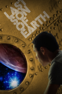




Oh yesss, rivets. There’s nothing steampunkier than rivets, but my eyeballs are convinced that the metal wall is spherical and that Flunky McWhatshisface is on the outside of it. Like, the galaxy is contained within this riveted metal sphere (which is still a cool idea) and Flunky is looking in on it. But I approve of this font choice. Suits the feel.
That is really cool
I like it!