“Better” Christian Entertainment
The Pure Flix movie Samson comes out on DVD this week. I haven’t seen it yet but the trailers certainly caught my attention. If I didn’t know anything about the story from the book of Judges, I would say it looks like another Conan the Barbarian remake. I can’t speak about its acting or storyline but the production values look quite well done.
Especially for a Christian movie.
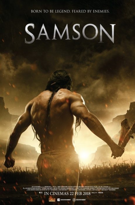
Image copyright Pure Flix Entertainment
Gasp! Yes, I said it. Despite continuing progress in delivering higher quality entertainment, the stigma remains. The instinctive reaction from Christians and the secular world alike is that Christian entertainment is inferior to the mainstream stuff. That’s usually because it is, at least from an artistic viewpoint. The reasons for this are myriad, not the least being more money being thrown towards secular studios and publishers, the fact that there are simply more secular than Christian entertainment creators, the sometimes-real, sometimes-perceived apathy of the church towards Christian art and entertainment, moral and spiritual boundaries that Christians are hesitant to cross, etc.
We could talk about what makes good art, whether Christian or secular, all day. We could also talk endlessly about what makes art “Christian.” Does it have to point to the Gospel somehow? Is art made by a Christian automatically “Christian art”? Is historically Christian art actually “Christian” considering its abundant errors, heresies, and the artists’ moral failings?
These topics are better left for other conversations. Here is what I want to consider: every Christian entertainment creator I know, myself included, would love to put out books with more expensive cover art, or produce movies with blockbuster-quality action scenes, or record music with higher production values. But does better artistic quality mean better Christian entertainment?
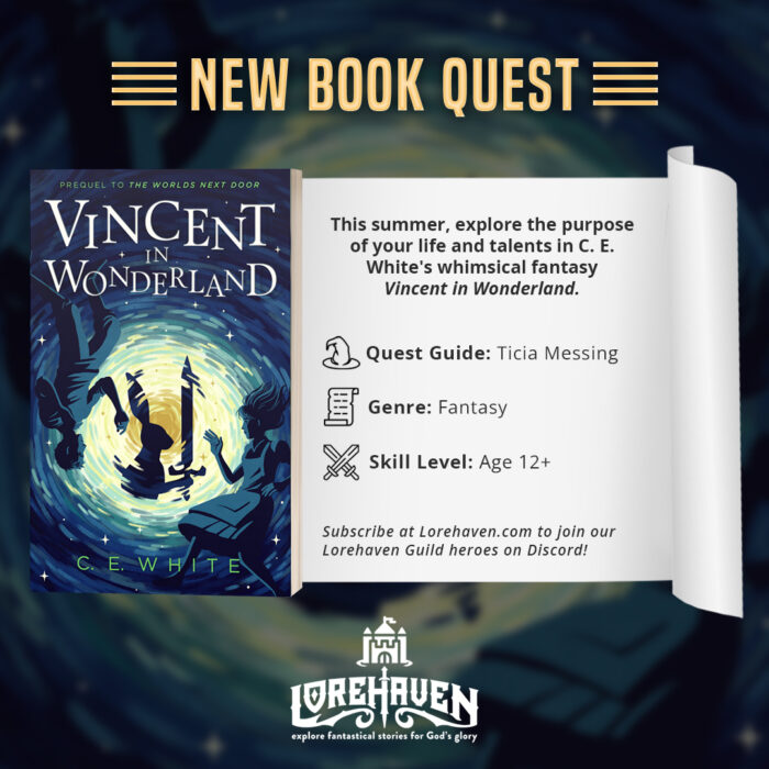
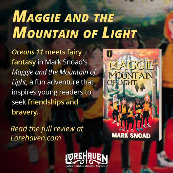
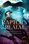
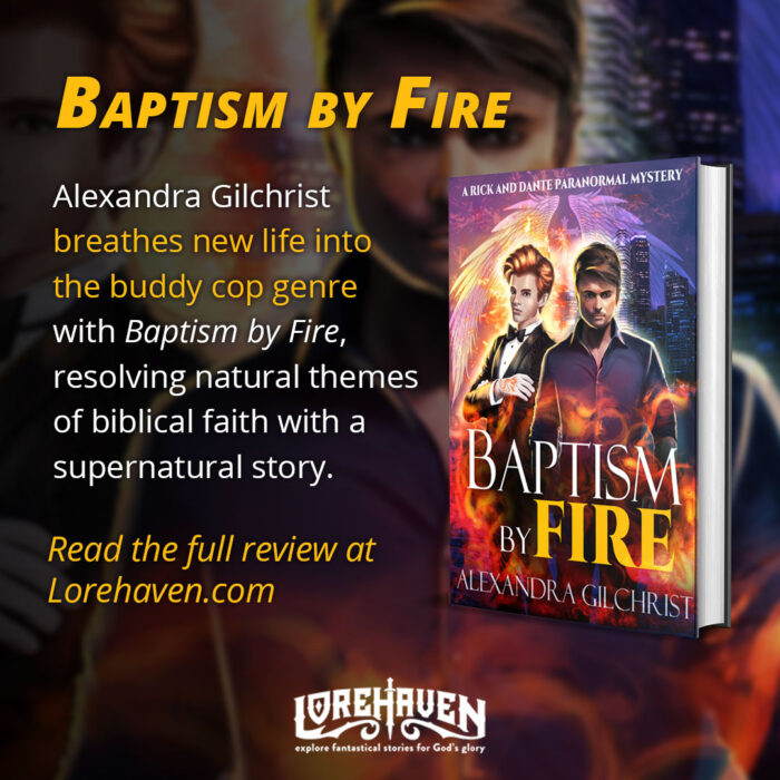
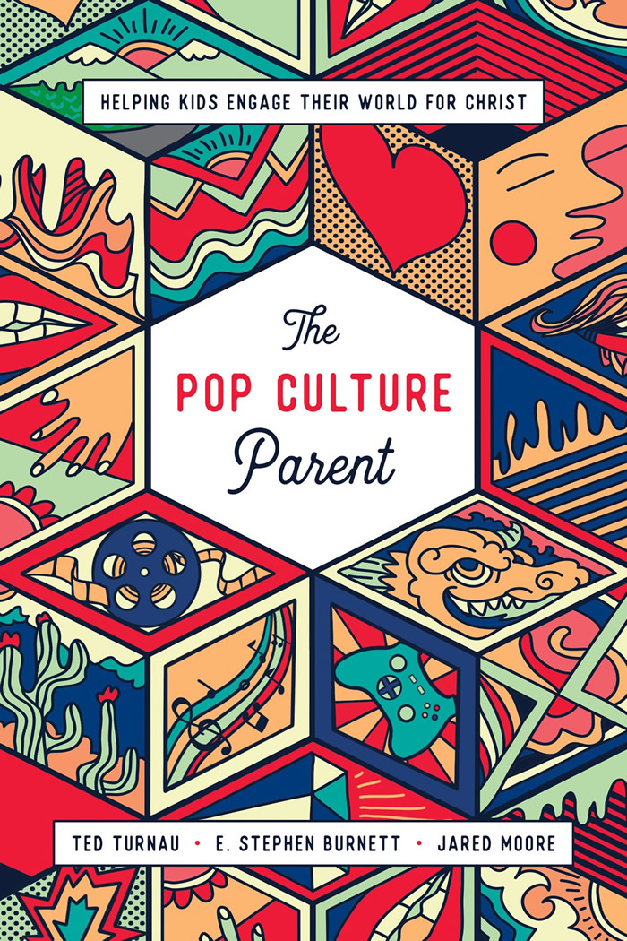
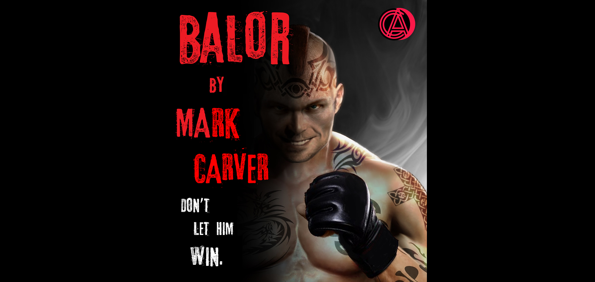
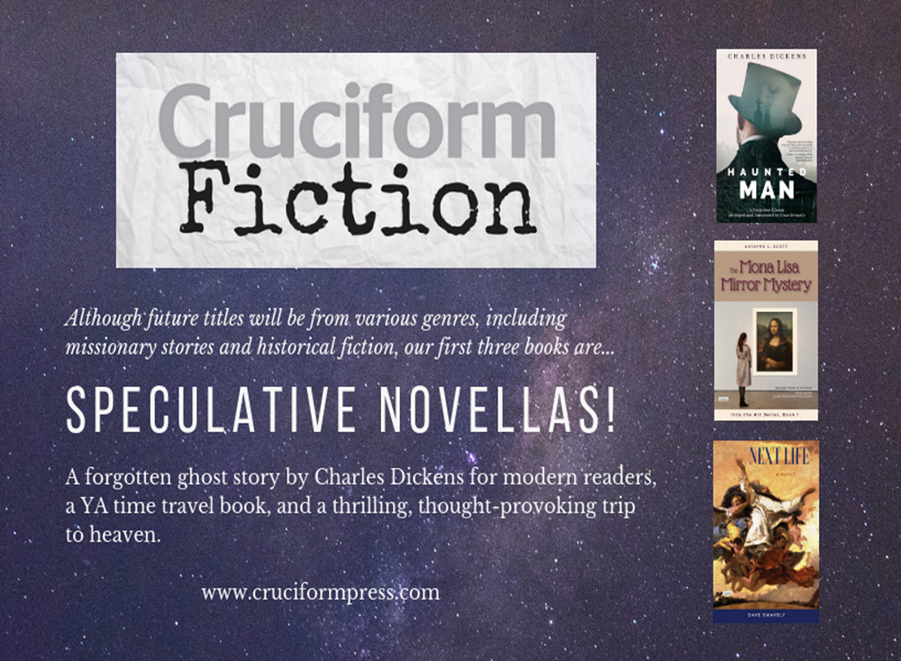
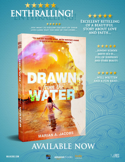
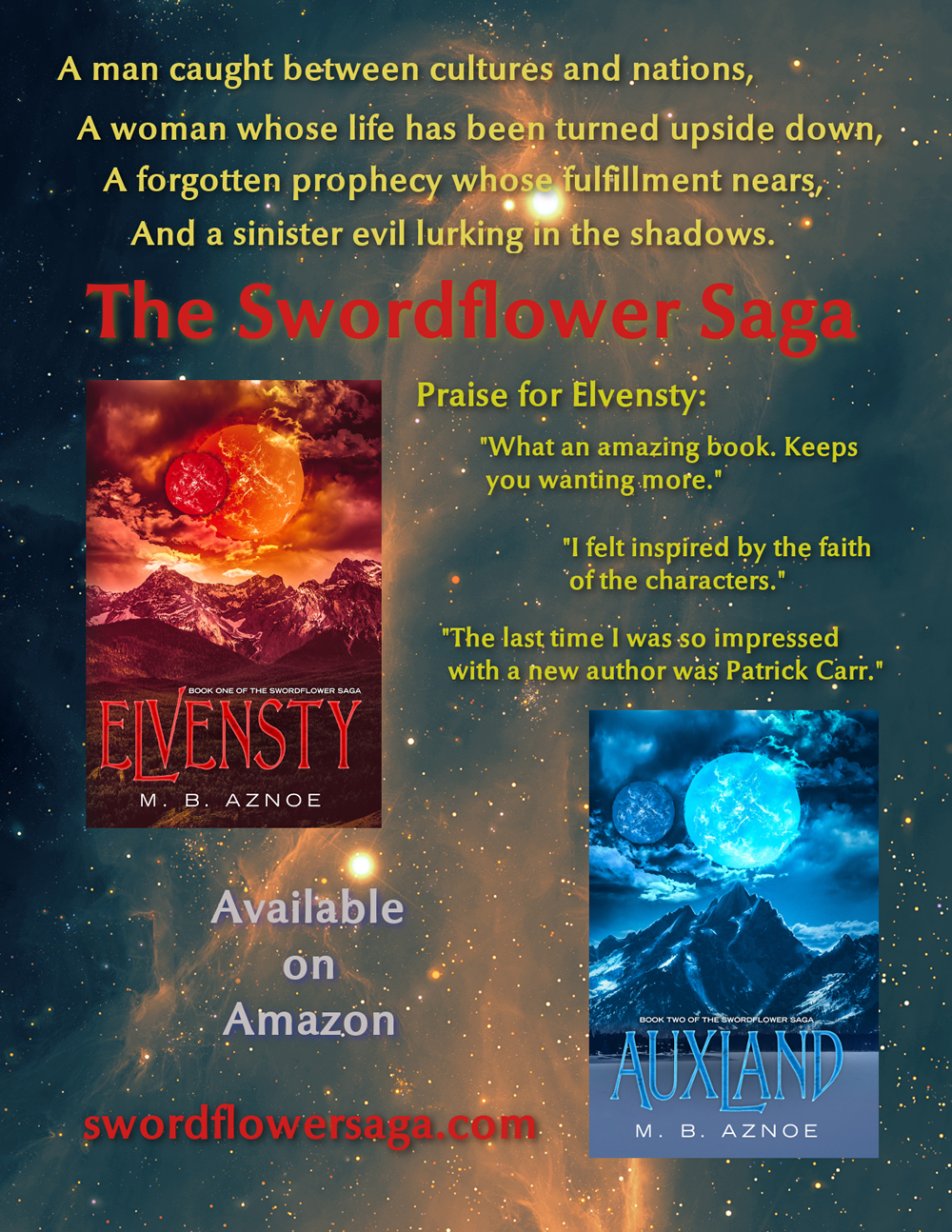
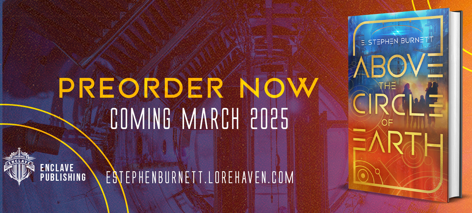
Since this article will reach more of the reading and writing crowd, let’s use books as our rubric. What writer hasn’t looked with envy at a beautiful cover image on someone else’s book? I’m not just talking about Christians envying secular books. There is a wide variety of cover quality within the Christian literary world as well. Everyone would agree that a better cover is one ingredient of a better book. A writer (and reader) will take greater pride in the finished product with that vibrant, glossy cover grabbing everyone’s attention. From a sales and marketing standpoint, this is certainly a wise move to make. The book itself, the content inside the cover, is not affected, and that’s what truly matters, but it would be dishonest to say that a reader’s enjoyment of a book, and the author’s pride, is in no way affected by the attractiveness of the cover.
 Does this make it a better product from a Christian perspective? It will most likely reach more readers with a flashy cover. It will make people pay more respect to the book, the author, and perhaps to Christian publishing as a whole. It may get attention from secular sources that otherwise wouldn’t look twice at a Christian book. So naturally, a bigger budget and a better produced product means better Christian entertainment, right?
In many cases, yes. But not automatically. The key difference in Christian and secular art is the reason why it is being created. A secular artist wants to make a statement, or achieve fame, or impress people. A Christian artist should create primarily for God’s glory. How that is manifested is different for each person, but every Christian artist, if they are being honest with themselves, knows why they wrote this book or directed that film. If it was for secular reasons, then it doesn’t matter how flashy or well-produced or well-received their product is. God’s glory must be the primary, not secondary or incidental, motivation behind its creation.
This doesn’t mean that Christians shouldn’t strive for success or should be ashamed of spending lots of money on their creations. However, Psalms 127:1 tells us that unless the Lord builds the house, the builders labor in vain. More money, more fans, more likes – these are the world’s measurements of success, not God’s.















Sometimes, actually very rarely, I’ve noticed how a book cover with nothing more than a blank black background and the title will seem bland and worthless but the story itself is worthwhile. Last Call by John L. Robinson comes to mind.
Minimalist style can also be useful if done with both taste and atmosphere to the story, such as Through the Fury to the Dawn by Stu Jones (gas mask and fog, scratchy title font, giving it the dreadful creepy vibe the story itself contains).
The last paragraph sums it all up for me.